
Title: Cost Inbox – Simplifying Receipt Management
Subtitle: Buildertrend Mobile App UX Case Study
Redesigned Buildertrend’s cost inbox feature to reduce lost receipts, improve categorization, and streamline expense tracking. Result: Increased user adoption, positive feedback, and improved app ratings


Problem Statement
Accounting staff and project managers frequently lost or misfiled receipts, leading to budget errors and inefficiencies.
Users needed a simple way to capture, categorize, and retrieve receipts instantly.
Goal
Primary goals for the Cost Inbox feature:
Make capturing receipts quick and reliable (≤ 3 taps to scan & save)
Improve retrieval with searchable categories and filters
Reduce lost receipts and manual entry errors
Align mobile UI with Buildertrend design system and increase app store appeal
Suggested targets (measurement): reduce lost receipts by 30%, cut log time by 50% within 3 months
Persona
The persona of "Sarah, the Accounting Bookkeeper at a General Contractor," was specifically created to focus on the needs and challenges related to scanning receipts, organizing, and tracking expenses for the "Cost Inbox" feature in the UX/UI design process

Storyboard
Identify Challenges: Used the storyboard to visualize and understand the challenges in tracking and organizing receipts.
Guide Design: Employed the storyboard methodology to inform the development of the centralized cost inbox feature based on user pain points.
Simplify Solutions: Ensured that the feature simplifies record-keeping and enhances efficiency by addressing identified issues.
Enhance User Experience: Focused on providing a seamless experience for bookkeepers, contractors, and construction managers, guided by insights from the storyboard..
Company Cam: Stood out the most for its intuitive and easy-to-navigate design, influencing my focus on a clean, user-friendly interface for receipt scanning and organization.
Expensify: Inspired by its streamlined receipt upload, guiding me to simplify workflows for users dealing with multiple receipts.
Dropbox: Borrowed ideas for quick document categorization, enabling users to tag and sort receipts efficiently.
QuickBooks: Observed their integration with financial tracking, shaping how the Cost Inbox connects with other project management tools for seamless expense management.
Framework Research


Low fidelity
Scanning receipts from hame page
Feature scan, upload photo and doc
Wireframe
Collaborating on Interface Design with Developers and Product Managers to Refine Verbiage and Content Positioning


In making the decision to bold certain lines within the list view, I carefully evaluated the importance of each piece of information and opted to bold the headings or key descriptors to enhance readability and highlight essential details for users
Home Page

Scanning Flow Prototype
High Fildeilty Propotype iOS
Scanning Receipt
Upload from photo
Upload from Document
Horizontal View

iPad Prototype


Collaboration
I collaborated closely with the Architectural Design team to implement a comprehensive update that encompassed changes to colors, navigation bar design, and a redesign of the login page.
This effort was part of a broader initiative to roll out a fresh color scheme following a complete overhaul of our company's logo. Additionally, I updated the navigation bar functionality for design and guideline purposes. Moreover, I made necessary adjustments to ensure that the navigation bar met WCAG compliance, enhancing its accessibility.

Navigation Tab

WCAG Compliance Results

White and Dark mode variants Nav Bars
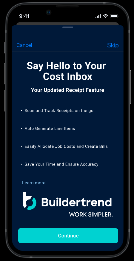
Marketing collaboration
The Cost Inbox feature required collaboration with the marketing team to create an enticing welcome design for new users.
With a multitude of potential solutions and procedures for showcasing the feature's benefits, we teamed up with the marketing department to refine our options and distill them into a concise five-step plan that would deliver a compelling introduction to users.

Content Design Early State
Content Design finale State


